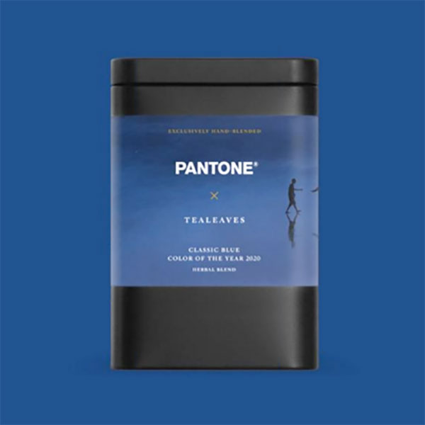
Pantone’s colour of the year announcement is always met with interest – some derision, plenty of lampoon, but always interest. This year it is a deep indigo-blue they’ve dubbed ‘Classic Blue’ or PMS 19-4052 and it’s a little reminiscent of their first colour of the year in 2000, Cerulean, which Meryl Streep defends in The Devil Wears Prada.
“A timeless and enduring blue hue, PANTONE 19-4052 Classic Blue is elegant in its simplicity. Suggestive of the sky at dusk, the reassuring qualities of the thought-provoking PANTONE 19-4052 Classic Blue highlight our desire for a dependable and stable foundation on which to build as we cross the threshold into a new era.”
I struggle with the pompous tone of these announcements but I concede, it’s not an easy task. Like politicians, Pantone seem caught between finding a cultural vision for the future, and merely reflecting current trends in design and aesthetics. Last year they went with Living Coral, not to my taste, but I admit it was reasonably indicative of the creative zeitgeist.
This year, Pantone seem to be trying to calm our frayed Trump-era, climate-crisis nerves with a kind-of soothing, if prosaic, blue. “We are living in a time that requires faith and trust” says Leatrice Eiseman of Pantone’s Color Institute. “It is this kind of constancy and confidence that is expressed by Pantone 19-4052”. They describe the colour as ‘genderless’ and ‘seasonless in endurance’, ’emblematic of heritage but at the same time highly contemporary’ – carefully avoiding the word conservative – perhaps in deference to the looming elections in the US and UK…
In much of the world (Australia, the UK, Brazil, Canada, Germany and Israel at least) the socially-conservative parties use blue for their identity. Whereas in the US, it’s the other way around: the left-ish Democrats take the blue, and the Republicans proudly the red. Funny because America has a strong, really-worth-fighting-for resistance to anything that might resemble communism which is unquestionably associated with red thanks to the French Revolution, the Marxists of the Soviet Union, the Khmer Rouge in Cambodia, and the Maoists in China and Vietnam. Better dead, as the McCarthy-era inversion ran, than red.
Growing up in the 1970s, the word ‘classic’ reminds me of classic hits on commercial radio stations or hard-edged pub rockers who played classic blues-rock to a crowd of brawling Aussie blokes. This was vastly at-odds with my counter-cultured pre-hipsterism which favoured the ‘indie’ sounds of the bohemian elite. Later I had a short break from my freelance life to work as a writer for IBM and I’ve never been able to break the association with Big Blue, as it was once known, every since.
And is it reassuring? Well yes, I think it is to some degree, but as with every manifestation of colour, context and contrast is everything. To me, Classic Blue is a little too reminiscent of Spielberg’s Jaws or James Cameron’s The Abyss for my comfort. I do love a deep blue but I maintain a primal fear of the ocean, despite a coastal childhood growing up on Sydney’s blue and gold beaches.

But shark-bait aside, I have to say I like it. Every year I attend Pantone’s annual webinar announcing, explaining, and sometimes defending their choice for colour of the year. Last year, I wasn’t convinced but this year… I think it’s a good choice. Safe maybe, but good. There is a kind of ‘seasonless’ quality to it (do we really need that word?), it’s certainly contemporary, and yet it’s quite, um, classic…
I’m also pleased that Pantone have added a synaesthetic dimension to this year’s choice too. They hooked up with Swiss taste and scent masters, Firmenich, to create favours that are ‘familiar and reassuring’: “Blueberry and fresh green notes are a distinctive feature of Classic Blue” says Emmanuel Butstraen, President of Flavors, Firmenich. “With our increasing focus on health and wellness, blueberries are in a real sense becoming rediscovered, and growing to be one of the most relevant flavors in many areas of food and beverages.”

And yes, there are some Classic Blue sounds as well from Audio UX platform, Landr to be released as a sound pack of Vivid Nostalgia. No suggestion they’ll give us a fresh take on the blues (how could they resist?) but I suppose that’s a bit too obvious. Anyway, as of today, there’s no reference to this on Lanr’s site so… I guess we’ll keep you posted on that.
So bravo Pantone. You don’t always win my heart but this year I’m in. You’re not taking too many risks but then, I think you’re right to play it safe, we all need a little chromatic reassurance right now…


